![]()
BrandBerry Marcom is a leading full-spectrum marketing communications agency focused on consulting, and delivering end-to-end, fully managed services.
M +91 9654591813
Email: talk@brandberrymarcom.com
BrandBerry Marcom Pvt. Ltd
H-91, Sector-63,
NOIDA - 201301.
Delhi NCR, India.

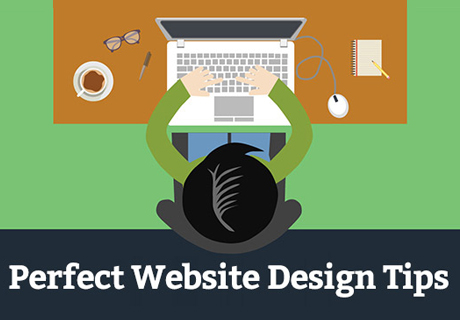
Tipping Designers on User-friendly Web Designs that are Also Appealing
To be a web designer is a surefire way to prove your artistic abilities. Web development and designing have created an exclusive seat for themselves in the communications and IT industry. Being a web development company in Delhi NCR, BrandBerry Marcom has scanned a list of ways that cater to-the-point while creating a user friendly web design, reflecting a clear strategy both in the front-end and back-end.
Understand what your user wants-
It's not only frustrating to visit a website that is hard to navigate but also, it is more annoying to find no appealing factor to browse the site at all. Website development is not only a domain to be used for information circulation, but also requires to make the information interesting visually to garner visitors' interest. Visual language is perhaps the mainstay of any website before a person delves into the other site metrics. As a web developer you are also required to look into the designing part and see how you can make it more interactive and comprehensive.
Website needs a proper navigation-
You can't afford to risk the worth of your web domain with poor navigation of the website. It is as important as having a traffic signal system on roads. Just imagine roads having no system to move on them, where and how will the traveler go? The same is applicable to websites. Visitors should be happy with the way they move across and find information on your website. Simplify your websites with clearer and comprehensible menus. Make them prominent to allow easy access of data on your site. Also, do not forget to limit the number of sub-menus levels. Keep the most important and most sought after pages in the beginning, like About Us, Services, Vision, Mission, etc.
User-friendly Tip- include a search bar in the top of the navigation chart to allow the visitor to find the information they seek, very easily.
Keep text vivid, distinct and legible-
Several studies reveal that website visitors don’t really read all the text mentioned on the site, they merely scan it. So why to write too much to read at all? It is therefore suggested to write only the critically important things or hire a content writer that can write suggestive and appropriate content to pull the visitor eyeballs to its content. Make sure your text is crisp and is visible on the smaller screen formats as well, since responsive websites are preferred mostly today.
To make the text more vivid and distinct, ensure that you add proper colors, leave white spaces closer to the text and use simple yet bold fonts that can set out from the lot and make themselves clearly visible.
Calligraphic fonts must be avoided as far as possible to avoid incomprehensibility.
The biggest challenge is to sometimes avoid clutter. Ensure a way to de-clutter the content while also adding contrast in the vibrancy of the background versus the foreground.
Make the website responsive-
It means to adjust the coding dynamics according to the variety of dashboards. The website should not only be responsive to all the output variants like a desktop, a mobile screen, a tablet , etc. but should also be prudent about the clarity of the icons, the text and the whole layout.
Upgrade loading time-
Users generally do not stick to websites that take several seconds to load. To avoid the abandonment of the site, optimize the loading time by optimizing the multimedia content on the site. Use them wherever highly essential. Combine the style sheets and script files to move the blocking elements to the footer of the website. You can also choose to place redirection links for the multimedia you intent to share.
Ask for only required information from the user on conversion-
Make your call-to-actions stand out. While you do that, make sure you also give the users a way to conversion, i.e. the mode to sign up to your services. While doing so, ensure that you do not ask for personal information, more than actually required like, ask for their e-mail id and not their postal address. De-clutter!
Visual Tip- Have a consistent color scheme. Choose not more than 2-3 colors for the entire theme of your website.
These simple points are always to be remembered while creating a website by both the developers and the designers if the aim is to attract maximum visitors that turn to you every time they need the services.
Design to leave a lasting impression!

Leave a Reply